Building Apollo

Apollo behind the scenes: see what we are working on right now!

Earth is round, Apollo is flat

Monday April 4, 2016

This week's update upgrades all workspaces to the new look and contains a list of enhancements and bug fixes. Read on!

Flat look for everyone

A few weeks ago, we released a new look for Apollo to The Brave Collective (the group of users who get to try new features before everybody else) and, excited by their feedback, the following week we made it available to all other users as well.
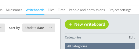
Flat look overview

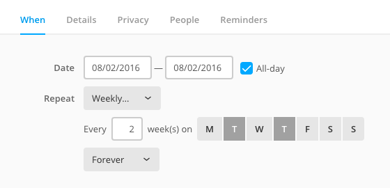
Flat look for calendar form

We didn't advertise it in any way in the application, and in hindsight it wasn't the best approach; only a very small fraction of users took the time to search for the new option and use the new look. The good part is that all of those who did make the switch, didn't switch back :-)

Because we think you'll like it, today we are upgrading all workspaces to the new flat style. If you didn't already, open your workspace and have a look!

If, for any reason, you'd like to keep using the previous style, just head to Settings > Company identity and scroll down to the Theme section to switch back. If you do, please drop us a quick email about what you didn't like… we care deeply for our users!

Image proofing features keep growing

The recently released image proofing feature is getting better everyday, also thanks to your feedback. For example, upcoming features will include adding multiple points for each annotation text, visual hints to show an annotation as resolved, or the ability to delete an annotation.

Your feedback is the best way to improve Apollo, so keep going, either inside the app (by clicking on the Feedback link, bottom left) or via email. Thank you!

That's all for today, but you can find a list of changes below.

Thanks for reading!


New features

  • Added file annotation entries to the project and the overview feed.

Enhancements

  • Bigger sizes and better handling of long element titles in the Add time dialog.
  • Email notifications: added entries for new annotations and new comments on annotations.
  • Long dialog titles no longer expand behind the dialog's close button.
  • Overview: in the Team performance table, companies now appear just before Unassigned.

Bug fixes

  • Even if not possibile in the file and writeboard detail page, adding comments to old file versions and old writeboard revisions was still possible in the preview section of the project activity.
  • For users still using the old calendar, some all-day events were not showing up. (Heads up: switch to the new calendar!)
  • In project writebards, the button to skip to the last page said "Next page".
  • Overview: the Team performance view doesn't account for tasks in archived projects anymore.
  • The "Reorder" link in the project task view wasn't visible after creating the first list
  • The pager in the project feed is now working.
  • When saving a timer connected to a contact or project task, the specified date wasn't being set, falling back to today's date.
Pan and zoom support in image proofing

Tuesday March 29, 2016

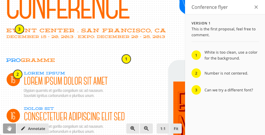
Image annotation example

Since last week's announcement, we had an explosion of requests to join The Brave Collective just to try the new image proofing feature.

Of course we need to keep The Brave Collective to a manageable size, because it wouldn't make sense otherwise, and also because it really takes a toll on support (the Collective takes its role very seriously!) Anyway, the initial feedback for the new feature has been very positive overall, with many suggestions about how to further build on it.

So this week we are making it available to everybody! This will spare us from turning down all those requests to join the Collective.

Read on to discover the improvements for this week!

Pan and zoom

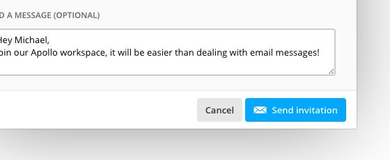
For those of you working with large images on small screens, adding annotations proved to be tricky, since those images were always scaled down to fit into the viewport. This was especially painful for users who work with very tall images – we're looking at you, Michael T.!

Well, pain no more! We removed the automatic fit to screen and added a shiny toolbar to let you pan and zoom images as you wish, view them in their original pixel size or, again, fit them to screen.

Image annotation toolbar with zoom and pan

It's worth mentioning that you can still pan and zoom while writing the annotation text; you won't lose anything.

Migration to the new calendar

We are happy to report that in just two short weeks since we made the opt-in free migration to the new calendar available, 68% of users already migrated to the new system, with virtually no headaches :-)

For those of you who haven't migrated yet don't worry, there's no immediate rush. Both calendars will be available for some time, but the old one will be eventually removed one day; don't worry, we're not talking about near future. In the meantime, we really want to do our best to make the new one suitable for your needs, so please drop us a line and let us know how we can help.

That is all for today. You can find a list of changes below.

Thanks for reading!


New features

  • API: added endpoints for interacting with the new calendar.
  • Reply by mail: added ability to reply to new annotations and to annotations comments.
  • Added a refresh button in My Tasks, for those who disable automatic updates.
  • My Tasks: deal and cases below each task can now be clicked to open them.

Enhancements

  • Calendar now shows the tasks "assigned to me" instead of those "I should keep an eye on".
  • Calendar: better visual separation between all-day and normal events.
  • Added annotation count in the project file list and the file detail page.

Bug fixes

  • Sometimes disabled users couldn't be deleted.
  • Sometimes wasn't possible to edit accessible projects for disabled users.
  • Creating a project from a template wasn't including the Inbox tasklist.
  • The project card/list view toggle wasn't working on Firefox.
  • API: some users were always getting a "forbidden" error.
  • API: in some rare circumstances, endpoints for Comments and Files were failing.

Announcing image proofing

Monday March 21, 2016

We're really pleased to announce that our first take on the image proofing feature is now available to The Brave Collective: in case you don't know already, it's those users that get to use upcoming Apollo features before everyone else; they help shaping the feature and – of course – may suffer from the occasional newly introduced bug!

What is image proofing?

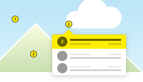
Image proofing in Apollo lets you add graphic annotations directly on project image files by placing nice yellow dots directly on the relevant part of the image, from which you can start a discussion and later resolve the issue. All major image formats are supported.

Even though we already have quite a few improvements planned for the image annotation feature, we really wanted to get it into the hands of The Brave Collective as soon as possible, because their feedback has always been very effective to improve the final product!

I hear you say: “Hey, what about the rest of us?” Don't worry and read on!

What everybody gets today

With image proofing taking most of our efforts, we still managed to sneak in a couple new features that come straight from requests from our users! Thanks to Christine L., William P., Roberto S., Bessie T., Qi Hao X., Georgia D. and Ronald K. for suggesting the two improvements described below.

Visible day range for the calendar

Even though remote work is all the rage these days, teams with all users in the same time zone expressed their need to hide all those empty hours – usually from midnight to 8am and from 6pm to midnight – in the main calendar's day, 4-day and week views. Well, there's now the ability to do just that: go to Settings > Preferences and select when your day starts and ends.

Default setting for “Let everyone see this task”

Once upon a time, we decided that tasks on the CRM side of things in Apollo, by default, were visible only to those who created or who were responsible for it, and provided the “Let everyone see this task” checkbox to override that, task by task.

But what happens when some teams always use it the other way around and explain their use case to the Apollo support? Well, you guessed it: there's now a new personal preference just for that. You'll find it in the Settings > Preferences screen as usual.

That's it for this week, thanks for reading!

New Apollo Calendar for everyone

Monday March 14, 2016

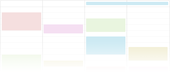
As some of you might already know, some time ago we introduced a new calendar for all new accounts. Today we're rolling it out for everyone!

If you started using Apollo recently, then you are already using the new calendar. We suggest to read this post anyway because you might find something useful you didn't know already!

How do you know if you're using the old or the new calendar? That's very simple: if you are on the old one, you will be reminded to switch to the new one at the login – you can't miss that!

Read on to discover all the new features.

Easier and more flexible

The old calendar had this rather convoluted model where each user could create any number of calendars to hold events, and then they could optionally share these calendars with other (internal only) users.

But, picking or creating a calendar was a required step, and this approach proved to be too heavy for smaller teams with simple calendaring needs. On the contrary, bigger teams with lots of calendar work were missing some more advanced features and flexibility, most prominently event categories, better filtering and meeting support.

In the new calendar there are just events, with optional categories and calendar names, and the creator of the event chooses who can see that event between a few simple choices (only himself / all internal users / all users including external users / only users in a specific project).

Meeting support

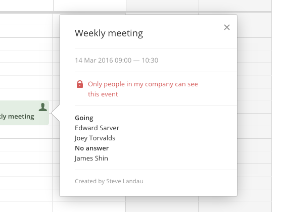
You can now invite users to your events. They will receive a notification email and will be able to RSVP. Attendance status is recorded for each event, and you'll have full visibility about who confirmed, who declined, who is unsure and who didn't answer yet.

Improved filtering

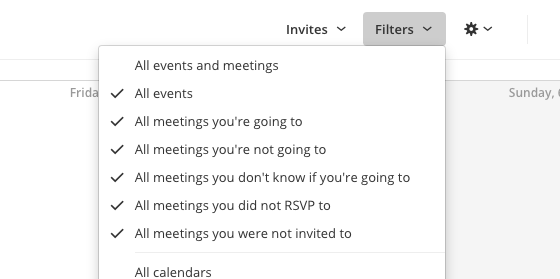
Filtering is now much more flexible. You can filter by any combination of event category, event calendar and event type. For example you can choose to see only events about meetings where you confirmed your attendance, and those that are still waiting for your RSVP. Or only standard events (no meetings) of a specific category. As before, you can choose to plot on the calendar area also tasks and milestones if you wish.

Easy meetings discoverability

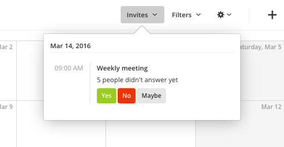
If you miss the meeting invite email, you can always see the status of each upcoming meeting by clicking on the dedicated Invites button, and also quickly RSVP from there.

Multiple iCal feeds

Unlike the old calendar, which only allowed a single iCal feed per user, the new calendar lets you generate multiple iCal feeds, each with different data.

For example, you might need a feed for all pending milestones, and a separate one for Meetings you did RSVP, or one just for events of a specific category.

To do this you just need to momentarily set the calendar filters the way you need, and open the iCal dialog to get the feed link, which will have all the filter information embedded.

Other goodies

Each project now gets a dedicated calendar, where you can find all events for that specific project. Of course, advanced event filtering and dedicated iCal feeds are available there too.

Recurring events also get some love: they can now have a reminder (or multiple ones), something the old calendar never had.

Easy upgrade

You will be able to switch to the new calendar and set your migration preferences at login time – just follow the easy on-screen instructions. For any question don't hesitate to contact our friendly support.

That's it for this week, we hope you'll like the new calendar! Thanks for reading!

Files section improvements

Monday March 7, 2016

This week's update for Apollo brings a little reorganization in the Files section inside projects, in order to improve the usability for common interactions, especially those regarding file versions.

Changes to the Files section

Sometimes, things were a bit confusing: there wasn't a clear distinction on what you were modifying when editing or deleting. To address this, every interaction is now applied to the latest file version. To further strengthen this, the interface has been updated with a few changes, namely:

  1. Clear message that deleting a single or multiple files will delete all file versions as well.
  2. No more expanding version list – open the file itself and select a specific version instead.
  3. Only the latest version of a file can be edited or commented now.
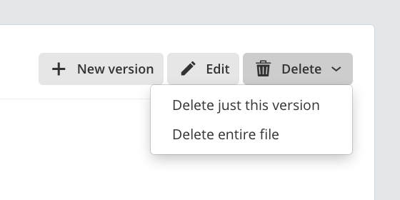
  4. Ability to delete a specific version or all of them (which avoids the tedious process where you had to delete every version to completely delete a file).

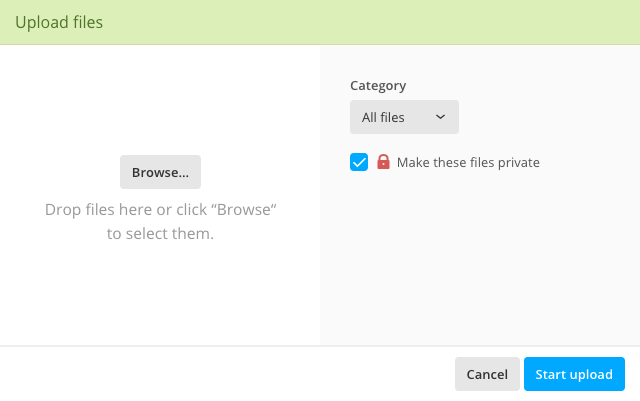
There's also a new window for uploading files: its file list is much more readable, and the upload will not start automatically after selecting or dropping files, so you'll have the chance to set up their options.

Once the upload starts, a progress bar will keep you updated, but you'll be also able to close the window while the upload continues in background. This will allow you to keep working in Apollo instead of waiting for the upload to complete and it's especially useful when uploading large files.

The new upload window is just a first step; new exciting features regarding uploaded files will follow soon.

Improved comment list

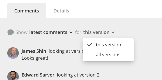
The comments section now lets you switch between all comments or just the latest ones, and there's a special option for files with multiple versions.

Previously, all comments from all versions were shown in a single list, and this proved to be confusing to some users. Now they can focus on a specific version and see only the comments pertaining to it.

That's all for this week! Thanks for reading, and keep sending your feedback, we love it!


Enhancements

  • Better alignment for the fields in the Edit file form.

Bug fixes

  • Recurring events weren't working correctly when they were set for Mondays; that's a confirmation that everybody hates Mondays.
  • Start time for recurring events wasn't being set correctly when daylight saving time would kick in.

Define preset lists of tasks for your contacts

Monday February 29, 2016

You guessed it! Another week, another update from your friendly development team here at Apollo!

As we mentioned in earlier posts, part of our development focus is geared towards strengthening Apollo's CRM features. (See recent updates: categories for contacts and contacts ownership, subscribe to contacts as a whole or to deals, and the new tasks view for contacts). The trend continues this week, with another useful addition…

Task list templates for contacts

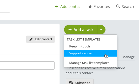
If you find yourself repeating the same list of tasks over and over (and over), you can now define a preset list of tasks and reuse it anytime by opening the dropdown menu of the Add a task button inside a contact.

To create a new template, just click Manage task list templates in this menu, or head to Contacts > Templates.

That's it for now, but stay tuned for more features. As always, there's a list of changes below, for those interested.

Thanks for reading!


Enhancements

  • Refactor/cleanup for Settings > Notifications.
  • Realignment/cleanup for the task picker inside the Save timer dialog.
  • Realignment/cleanup for the project and contact task pickers inside the Add task dialog.

Bug fixes

  • Filtering contacts by tags was stopping the pager from working after the 2nd page.
  • The project's Time page wasn't updating after deleting a time entry.
  • The project list title said “sorted by” even when the selected view was meant to be “grouped by”.
  • The contact name in the project list was shown as Last name - First name instead of First name - Last name.

New card view for projects

Monday February 22, 2016

This week's update brings fresh air to your project list. By the way, this is the 15th Apollo update in the last 15 weeks, yay!

Introducing the card view

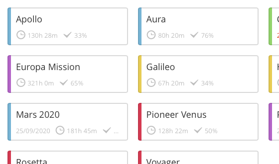
If you're a novice user, or just don't like complex visualizations, you'll be relieved to know that Apollo now sports a card view for listing projects. It shows projects as friendly cards containing just the essentials: project name, its category color, due date, the amount of time logged on it so far, and its overall progress. They're easier to click and even easier to scan when grouped by category, contact or project manager.

We received this request quite a few times in the past, but it wasn't until one of our users, Stephen from Loughborough University, did the extra mile and sent a nice hand-drawn sketch that we decided to took the plunge and make it a reality!

The card view will be the default from now on. You can switch back to the list view by clicking the Card view/List view buttons near the search box.

Project manager indication

After adding the ability to add a project manager to a project, some people asked to see the project manager in the list view.

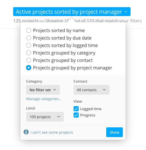
We don't know how we missed this, but that sure was a legitimate request. So now you can do it: while in the List view, just click the page title (a.k.a. the filtering options dropdown), click the Project manager checkbox and click Show. That's it!

Those were the the most important changes for this week. Read below for a list of enhancements and bug fixes worth noting.

Thanks for reading!


Enhancements

  • Contact form: added empty values for the Owner and Category fields, so they disappear if you're just tabbing between all fields without selecting any value.
  • Better spacing and responsive layout for a few pages in Projects (Writeboard form, Project settings, Search), Contacts (Contact form, Search), and Settings (Company identity, Account, Regional settings, Preferences).
  • Better support for encoded filenames for files attached to elements created via email.
  • Deal form: smaller footprint when using the new flat look.
  • Added color to submit buttons, to indicate the default action.
Bug fixes
  • The estimated time wasn't being stored when saving a task for a project template.
  • Calendar: due to a timezone issue, events recurring for more than a year were being saved with a wrong time value.
  • Secondary rows in tasks were visible even when empty, leading to a waste of vertical space.
  • Removed nasty flash effect when clicking “I'll restart later” after a new version of Apollo is available.
  • Fixed uneven radio button spacing inside the filtering options tooltip in My Tasks.
  • Group form: added a background color to the user list when using the new flat look.
  • Overview: tasks marked as Started were showing as Completed.
  • Tag management: fixed random empty space when there wasn't any tag for a given letter.

Assign responsibility for an entire project

Tuesday February 16, 2016

This week's Apollo update brings good news to a group of users who were fairly vocal and consistent with their wish.

It all started 6 months ago with a request from Micha M., which was quickly followed by similar ones from other users. Once we realized it wasn't an isolated request, we were more than happy to follow through. So, from today you can…

Set a project manager and see all its projects

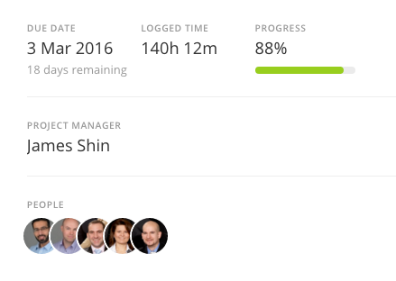
You have now the ability to select a specific person in a project to become the project manager. All you have to do is open a project, go to Project settings and select the corresponding user in the Project manager field. The project manager will be shown on the project summary in the activity screen.

But there's more: you can now group projects by project manager in the project list, for easy tracking.

Flat style to become the default one

After unveiling a new look for the Apollo user interface last week to The Brave Collective users, we didn't expect to receive so many comments and praises about it. We even received a feedback asking to fix the feedback window itself!

In fact, we have received so much feedback that, even if it's still a bit rough, we're going to set the new look as the default one for new workspaces, and giving everybody the ability to switch back and forth between the old and the new one. Remember though: we'll move away from the old look once we're confident enough that the flat one is ready, so we can focus on a single look and new features.

To switch to the new look, go to Settings, then Company identity, scroll down and click the box with the new style (the one on the right), then confirm your choice to reload Apollo.

That's it for this week, but we also have a fairly large list of changes below.

Thanks for reading!


Changes

  • The new overview do not show disabled users anymore (thanks Janine W.!)
  • Flat style: to save space, buttons in the rich text editor are now smaller.

Enhancements

  • Project list: the dropdown menu items for the “Project options” buttons have now a different order and are easier to follow.
  • Project list: added a “Manage categories” link inside the view options dropdown.
  • Project list: due project dates are now shown in red.
  • Better alignment and spacing for the writeboard and contact forms.

Bug fixes

  • The first date textbox in the Project's Time reports page was missing the left border.
  • My Tasks was not showing any task when grouping by Task type.
  • Projects with no due date were being shown in the project list as having a due date set at 01/01/5000. No doubt, even a deadline so remote would have been missed.
  • The invite form in the People and permissions screen was being cut off in some cases.
  • Main overview: the “Show more” button was missing some white space below it.
  • Flat style: some arrow buttons weren't correctly filling their container.
  • Flat style: feedback type selection buttons in the feedback window weren't showing correctly.
  • Flat style: a project's main menu items weren't collapsing inside the dropdown menu when there was little space to show them.
  • Mobile: changing the status of a task wasn't updating all views showing that task.

An upcoming new look

Monday February 8, 2016

Welcome back to another Apollo update! This week we'll show you the upcoming flat look and a few other enhancements.

Flat style user interface

Since the start of the flat design trend we started thinking about making a flat look for Apollo. And then, a few months ago, we started building it! So, today we're announcing thata new, flat user interface for Apollo will be available soon!

Here's a sneak peek:

It's not a new layout – we don't want to disrupt any workflow, everything is still where it's supposed to be – but a style refresh with a bigger, cleaner font, round avatars and bolder colors. Since it might have some rough edges here and there, starting today it will be available only to those users who joined The Brave Collective.

If you're interested in trying it out (by joining The Brave Collective), drop us a line at contact@applicomhq.com. You'll be able to switch between the classic look and the flat one. Eventually, the former will be phased out and the latter will be the only one available (cue Highlander theme song here).

Infinite writeboard revisions

We felt a little bit dumb when one of our users, Ben H., told us that he couldn't go past the 127th writeboard revision. We admit we used a light-minded approach when setting this limit.
Well, it took a few minutes to raise it and make Ben happy.

Writeboard revisions can now reach – lo and behold – over 2 billion! We know it's not really infinite, but that looked like a nice heading.

New “assigned date” information

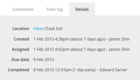
We now store the date of assignment which, together with the completion date, will be very useful to people who want to keep track of time passed between the two dates.

You can see this information in the task's Detail tabs and in every CSV file.

That's it for today! You can see a list of changes below.
As always, thanks for reading!


Enhancements

  • Dragging a task now looks better, with spacing on the sides

Bug fixes

  • The company checkbox in the writeboard form's notification section wasn't selecting all users from that company
  • Creating a tasklist from a tasklist template in a PROJECT template would result in an empty tasklist
  • Tooltips were always showing the last word of a sentence on a new line
  • Some tasklist elements (the load indicators and the creation textbox's "+" icon) weren't aligned to sibling elements
  • Under very rare circumstances, saving a timer would add again the last saved time entry to the last opened project
  • The link to create a project from a deal, albeit not working, was visible to non-admin users

A new overview screen

Monday February 1, 2016

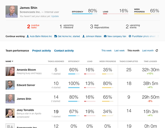
If you haven't already guessed by seeing the image above (or reading the title of this post, duh!) this week's update includes a new, much more useful Overview screen!

The upper zone of this screen puts you front and center: your performance indicators (Efficiency, Load and Week progress – more about these in a moment) are the first thing you'll see, followed by upcoming and overdue tasks, milestones, events and deal responsibilities, and then by a list of things you're working on.

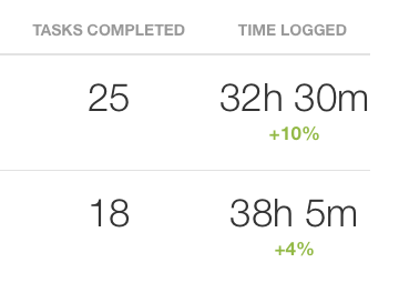
Then there's a completely new team performance board that shows some key stats for each user in your workspace. Here you can see the same three performance indicators, the number of currently assigned tasks, the number of completed tasks and time logged in a specific time range.

When you select a past time range (that is, not “This week”), the rightmost columns also show the difference with the previous period.

Of course, the activity on projects and contacts is still available, so you can follow your team and go back in time to see exactly what happened.

The performance indicators

The three indicators are there to measure your work. Here's a rundown of their meaning:

Efficiency shows the share of tasks assigned to you that are still current (that is, that are not overdue). In other words, the fewer overdue tasks, the higher your efficiency.

Load is the share of overall active tasks assigned to you. In a perfect world this would show roughly the same value for all users of your workspace (and we would be writing these lines while drinking a Mojito on a beach in Cancún), but that's often not the case, so if you see this value skyrocketing, you might want to balance it back with the help of your team.

Week progress is the share of completed tasks assigned to you due by the end of the current week and – as its name suggests – it shows the progress of your work for the week.

Wrap up

We hope that the new overview screen will further improve your teamwork. To use it, just open Apollo!

We'd like to say thanks to the users of The Brave Collective who have been testing this feature for the last two weeks. By the way, this update brings us to the 12th release in 12 weeks straight! Talk about dedication!