Building Apollo

Apollo behind the scenes: see what we are working on right now!

Import template into a project

Monday June 13, 2016

Here's a new update for Apollo. Today we'll talk again about project templates, but there's also a new feature for the Calendar.

Import template into an existing project

Aaah, project templates… They're so useful that they often take the stage here. Just in the past month we added the ability to create a template from a project and then to customize what's included in it.

Today we are fulfilling another request that showed up lately from our users' feedback: the ability to merge a template into an active project. This is particularly useful when the scope of the projects changes during its life.
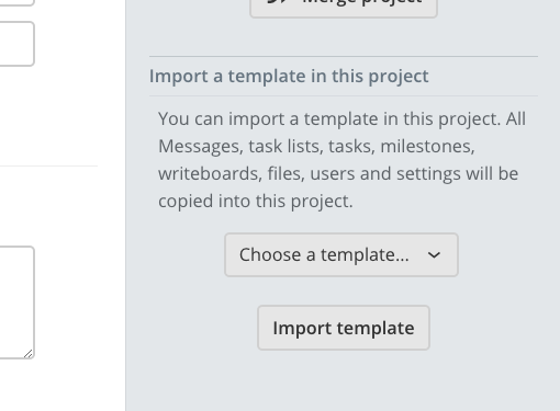
The 'Import template' block in the project settings

To import a template, head to your Project Settings page and look for the Import template block on the right side of the screen.

Set a default calendar for new events

If you're an avid calendar user or just a very busy person, you know it's important to add events as fast as possible. While you can add a generic event in a few seconds (just click or drag a timeframe in the calendar, type the event name and press Enter), choosing a calendar name for the event to go in might become repetitive and slow you down, especially when most of the events goes in the same calendar.

Starting today, you can select a default calendar for all new events you add.
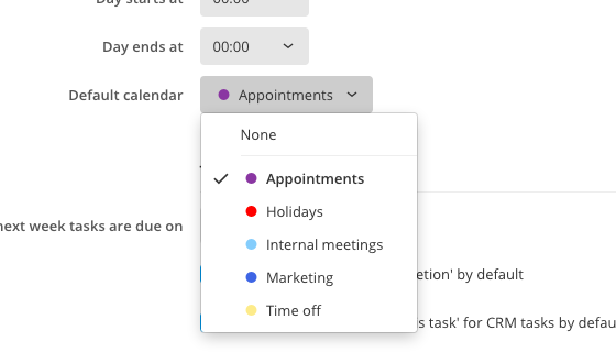
Dropdown menu for selecting a default calandar

This also useful if you're often in a hurry and want to add an event quickly and deal with it later.

You can specify the default calendar by going in Settings > Preferences and looking for the Default calendar field.

That's all for today, see you next week!


Enhancements

  • Completed tasks now show their completion date in place of the due date.
  • Updated page look for Settings > Defaults. Admire the beauty and layout of a… page so rarely used that you might question why we took our time to update it. (hint: for consistency)

Bug fixes

  • Squashed a few Javascript errors when the user received new permissions while navigating around project sections.
  • Disabled Buttons and Select controls looked like they received focus, when clicked. Plot twist: they didn't really receive focus.
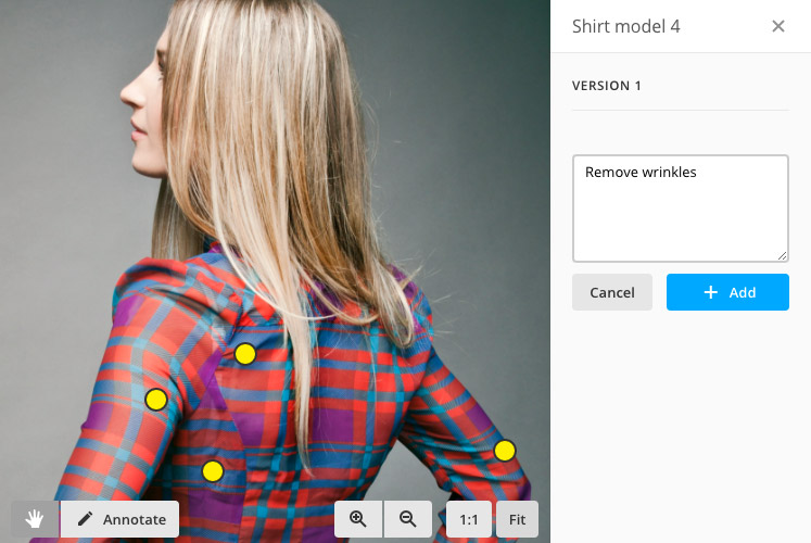
Multiple points for image annotations

Monday June 6, 2016

When we announced the first version of the image proofing feature, we knew that it could be too limited for some advanced users, so we made a development plan to expand its functionality over time.

A couple weeks ago, we introduced the new file list which, in addition to being cleaner and faster, has been redesigned to better assist the image proofing feature. Today, we're adding the ability to draw multiple points for each annotation.

Example of multiple points

So how does it work?

It's so simple it doesn't even need an explanation, but here it is: start by clicking the Annotate button, and from there, each click on the image will add a new annotation point. When you're done, type your comment in the text box and click Add to save.

As always, you can still use the Zoom and Pan tools to move around while in annotation mode; your comment, along with all related points, will remain visible.

More coming

There are more features coming up for the image proofing feature, so stay tuned. In the meantime, we hope that this one will make your workflow a little better.

Thanks for reading! Those interested might want to have a look at the list of minor changes below.


New

  • Attachments to project elements (messages, comments, etc.) can now be deleted from the Files section.

Enhancements

  • Project settings: added color indicators in the Category selection box.
  • Better late than never: all pages are now HTML 5.
  • Smaller arrow size in the "Recently completed" button in task lists.
  • Under the hood improvements to speed up image loading and data saving.

Bug fixes

  • Changing user permissions in a project didn't propagate the changes to that user, so it would't never be able to access that project or its features.
  • The Dropbox integration had a few minor errors here and there.
  • The project search wasn't working anymore. Sorry.
  • Signup: the avatar for the logged user was, ahem, too prominent.
  • The Manage subscription dialog was showing a fatal error in some cases.

Make use of tasks’ start date

Monday May 30, 2016

A few weeks ago Tasks received the ability to have a Start date, anticipating a future Gantt chart feature. Since then, the Start date has been left in a corner; you couldn't do anything with it, except knowing that a task had this date set and act accordingly.

Today we want to start taking advantage of it.

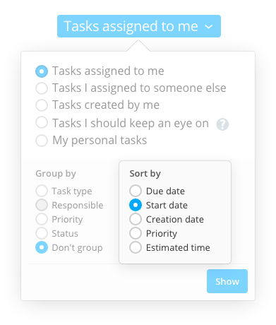
First, you can now sort tasks by their Start date. This will put earlier tasks on top and help you to prioritize them better.

The new task sorting methods

While we were at it, and since other users already asked for this one as well, we also added the ability to sort by creation date.

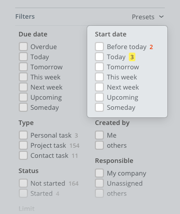
In addition to that, you can filter tasks by their Start date. This means that with a couple of clicks you could, for example, see all tasks that should have started already, but didn't, or see only tasks that need to be on your focus starting next week.

Filters for the Start date field

Also don't forget that now you can save your favourite filter sets by using the Filter presets feature we released last week! So what are you waiting? Go ahead and create your “Tasks that should be started but are not!” preset! Blaming fellow coworkers has never been easier :-)

Thanks for being a part of this

Thanks to all those who submit their feedback and feature requests. Please keep doing that, we love it! If you didn't already, what are you waiting? We are a very approachable team :-)

As usual, you'll find a list of all changes below.

Thanks for reading!


Enhancements

  • File uploads are now faster and return more user-friendly error messages.
  • Image thumbnail and preview generation is faster and supports even more image formats, like TIFF files.
  • API: Better rate limiting for those abusing the service with un-optimized code.

Bug fixes

  • The number of total tasks in a tasklist wasn't being always updated when moving a task in another tasklist or project.
  • The "Go" link for scrolling to a specific task list in a project was not working.
  • Adding items via email sometimes claimed that the quota for the workspace had exceeded, which was not the case.
  • Mobile: adding a task in a project task list resulted in the task being added to the project's Inbox.
  • API: Adding a task with no due time resulted in a task with a due time set at midnight (UTC time zone).

Save filters presets in My Tasks

Monday May 23, 2016

Welcome back to our weekly appointment, with new features and updates regarding your lovely project management software. Read on to find out this week's news!

Filter presets in My Tasks

With great powers comes great responsibility (we've always wanted to use this). In My Tasks, you have the ability to filter tasks as you wish; the controls available there can lead to millions of combinations.

Most people, however, only use a handful of combinations, and switches back and forth through them often, and each time quite a few click and a little mental effort are needed, depending on the number of filter checkboxes needed.

Well, today you can save a filter preset and recall it whenever you want.

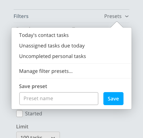
The filter preset dropdown

To do this, just set the filters to your likings in the My Tasks screen, then click on Presets, type in the preset name and click Save. From now on you can recall the same preset by clicking its name in the list. To change the preset name or delete it, click Manage filter presets.

Smarter contact management on deal creation

If you use Deals in Apollo you know that if you want to add a deal and associate it to a contact that doesn't exist yet, you have to add that contact first, or you'll get an error saying that the contact cannot be found.

Well, no more! Today's Apollo is smarter, so when you're in the Deal form you can either search an existing contact and select it from the dropdown, or just type the name of a new contact. Saving the deal will also create the contact, along with an initial task to remind you to check the contact's data.

That's all folks! Read below for a list of minor enhancements and bug fixes, if you're interested.

Thanks for reading!


Enhancements

  • Automatic dialog box resizing when writing a task's extended description. Yay, automation!
  • Faster loading of contact and user avatars.
  • Added a secondary message to inform the user that the task lists page needs to be reloaded, since it wasn't visible when working below the fold.

Bug fixes

  • New look: the height of buttons with arrows weren't quite right in some places, while it was downright wrong in some others.
  • Some contacts were playing hide and seek, thus not showing up in search results.
  • The overview page was being refreshed even if the page wasn't being shown. Which was useless, since nobody can see hidden digital elements.
  • Category names weren't visible in the Google Drive file picker.
  • The Basecamp importer was breaking when not importing files, making it one of the rare cases where a program stops working when not doing something.
  • In some cases, switching away and coming back to the project calendar wasn't working.
  • Email notifications were not showing file attachments anymore.
  • Contact avatar thumbnails were showing in their original sizes (256px) instead of the right one in some places.

Announcing the new File list

Monday May 16, 2016

File list abstract

Today, we are thrilled to show you a major refresh of file management in Apollo: a new, cleaner and roomy File list in projects.

The case for a new list

The original file list was there since the very first version of Apollo. It was built in 2009 as a simple way to share files with other project members, and it's got a slew of new functionalities over time, to keep up with project files' features: versioning, comments, Google Drive integration, image zooming, bulk actions, and lately, image proofing and the approval workflow.

All of these features introduced new elements or bits of information that needed to be shown along each file, and image proofing and file approval features were no exception: they made the screen busier than ever, and it was clear that the list needed a complete makeover.

So, what's new?

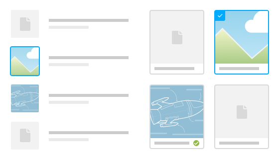
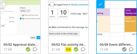
To start, there's the ability to view files as cards, with bigger, easier to click image thumbnails, which are now of higher quality (those of you with retina displays will notice the improvement).

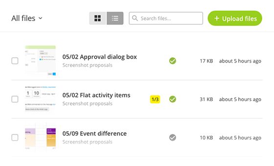
Overview of the file list

Then there's much more room available to display your files, thanks to the removal of the sidebar. All controls to change what you see on screen have been moved to the top, consistent with the latest views in other parts of the application.

Card view for files

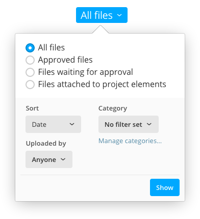
Lastly, there's the ability to see approved files only, files that are awaiting for approval, or just files attached to elements in the current project.

Filters and view options for the file list

Other minor improvements include a dialog box to edit file categories (just like in the project list), and the ability to see the number of annotations for each file, along with how many of them have been resolved. Of course, everything from the previous list is still there, no functionality has been removed.

Hopefully the new list will make your work easier, and boost your productivity.

Thanks for reading!


Bug fixes

  • In some circumstances, the number assigned to annotations wasn't unique for that set.
  • In rare cases, two project files were being shown as being different versions of the same file.

Templates and Calendar enhancements

Monday May 9, 2016

This is the 26th Apollo update in the last 26 weeks – that's a 6-month straight streak! Whoooo :-)

More options when creating templates from projects

A couple weeks ago we announced the ability to create templates using an existing project as a starting point. Many of you did appreciate the new feature, and some even suggested how it could be improved; we love that!

One particular feedback from Mark R. (thanks Mark!) was then echoed by a few more users: you wanted more control on which elements of the starting project get copied over the new template. As you may know, our development model is strongly centered around your needs, so we quickly seized the opportunity!

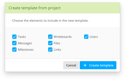
Template creation options dialog box

When creating a template from a project, you'll now be presented with a dialog box that allows you to customize the template creation process. Using the checkboxes, you can exclude specific class of items from being copied in the template.

Bright colors for calendar events

Our work to make the new calendar always more suitable to your needs continues. After adding the instant event preview a few weeks ago, today the events themselves get a usability and stylistic change.

A few hardcore calendar users (that is, people who manage a lot of events) made us notice that event colors were too subtle and washed out for being recognized at a glance, and this impacted their ability to get a sense of the whole week. Their suggestion was to make those colors brighter.

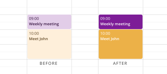
After we were sent screenshots of their calendars, we had to agree and change how the events are displayed on screen. Below is a comparison between the old and the new look:

Event color difference: before and after

Pretty stark, huh? The old look used a toned down version of the color you choose in the event form, while the new one uses the exact same one, and adjusts the text color accordingly.

That's it for today, thanks for reading!


Enhancements
  • The extended description field inside the forms for adding tasks can now be taller.
Bug fixes
  • The extended description field in the Task forms didn't resize the dialog box when expanding (thanks Sahan H.).
  • In some rare circumstances, the signup process was hanging because of a duplicated referral code generation.
  • Users with no permission to edit or delete files were presented with the Edit and Delete buttons (albeit not working) in the File detail page.
  • Editing a file with approval enabled sent a duplicate notification email to users.

Introducing the File approval workflow

Monday May 2, 2016

Welcome to our weekly update for Apollo. We've got a nice new feature related to project files, and some refinements to the new flat look. Read on!

Ability to mark files for approval

Discussing file changes with customers and teammates is one of the pillars of project management; because of this, the ability to share files in a project has been a major feature of Apollo from its early days.

Starting today there's a new, very useful feature: you can request a file to be approved by the people working on the project.

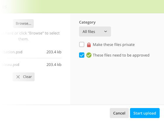
So how does this work? When you upload a file or edit an existing one, you'll notice that there's a new checkbox to mark the file as needing approval.

Upload file window with file approval enabled

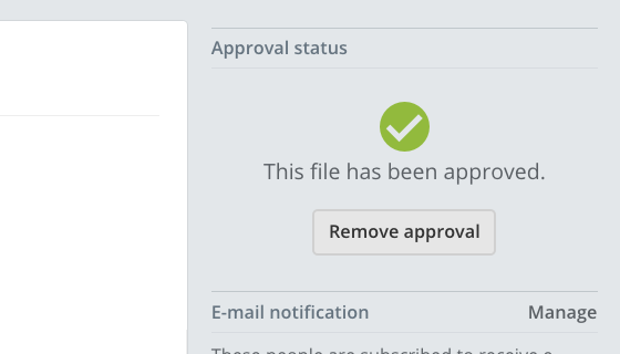
Once the checkbox is checked, the file can be approved by anyone working on the project. To approve it, or to remove the approval, open the file detail page and look for the “Approval status” block.

File approval status

The approval status will also be visible in the file list, and all people subscribed to changes to that file will receive a notification about the file being successfully approved.

Flat interface update

There's also a couple aesthetic changes for the activity feed in Overview: we have updated some of the few elements that were still sporting a non-flat look to match the new flat look. In short, shadows and gradients are gone, replaced by a more minimalistic look.

Flat elements in the overview feed

We're continuously tweaking the flat look and we plan to make it the only one available once we feel it's mature enough. We unveiled the new flat user interface a couple months ago, then we made it available to all users, and finally we made it the default one for everybody a few weeks ago.

We're done for today! There's a small list of enhancements and bug fixes below, if you're interested.

Thanks for reading!


Enhancements

  • Better alignment of the color bullet in category selectboxes, and better icon alignment in general.

Bug fixes

  • After using the full Note form to add a note, the “Note created successfully” notice was being shown everytime a new task was added.
  • Removed extra space above the first field in the Uplad file form.
  • Sometimes tasks in “Tasks across your projects” and the relative CSV file weren't matching.
  • Saving an existing contact without setting an owner was causing an error.

More power to project templates

Monday April 25, 2016

Welcome back to our weekly appointment to showcase Apollo's new features. We've been bashing our keyboards too much for today's newsletter (read: it's longer than usual) so, without further ado, let's see what's new.

Create templates from existing projects

It usually happens that you do the same kind of work over and over for different customers. If you're a wedding planner, your projects' names are almost always called “Wedding - Mark & Hannah” or something like that, to the point that you have created a basic project template to avoid starting from scratch every time. And as you probably already know, the ability to create project templates has been available in Apollo for a long time.

But sometimes you realize that the project you're already working on would be a perfect starting point for similar ones, and that it would be cool to create a new template starting from the current project.

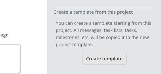
Starting today, it's possible! Just head to the Project settings, scroll down to Create a template from this project and click Create template.

Interface to create a template from a project

The current project will be used as the starting point for the new project template, which in turn can be used to create new projects. Project-ception!

Of course, all tasks in the new template are reset to “not started”, comments are deleted, milestones' due dates are set in relation to the current date, and so on. By the way, the templates opens automatically, so you'll have the chance to clean it up a little bit right away.

Confirm message when deleting calendars and calendar categories

The introduction of the new Calendar brought some new interactions in Apollo. One of them is the popup window to manage calendars or calendar categories. The way this was intended to work is very straightforward: you could rename and/or delete any category or calendar without commiting your changes, until you pressed the Save button.

Unfortunately, this meant that you could also delete an item, add a new one, rename another, and then forget you had deleted the one at the beginning, so pressing the Save button would submit all changes – including deletion – without asking for a confirm. Eeew!

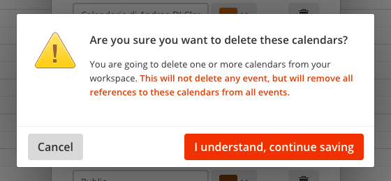
Even if deleting a calendar or a category does not delete any event, all references to that calendar or category are removed from all events. That's a serious loss of information for heavy calendar users. That's the reason for the new message asking confirmation for deleting the selected categories or calendars.

Deletion confirm message

We feel somewhat dumb for having missed this. Many thanks to Janine W. for sending this in.

We're done for today, and we look forward to the next week's update. There's a tiny list of bug fixes below, for those interested.

Thanks for reading!


Bug fixes

  • Tasks related to a note were not showing the link to that note anymore.
  • The contact detail for companies was missing the “People in this company” block
  • Overview: the date for upcoming tasks in the task counter dropdown was being shown as “Someday”.

Instant previews for calendar events

Monday April 18, 2016

Hello! This week's update brings great news to heavy calendar users and also some needed orderliness to the contact, deal and case detail screens. By the way, this is the 23th Apollo update in the last 23 weeks. We're on a roll!

Super fast event preview

One popular request from loyal users that are switching to the new calendar was that they didn't want to lose the at-a-glance information when hovering events, and we agree that that was a super useful feature, even more for those with very busy calendars.

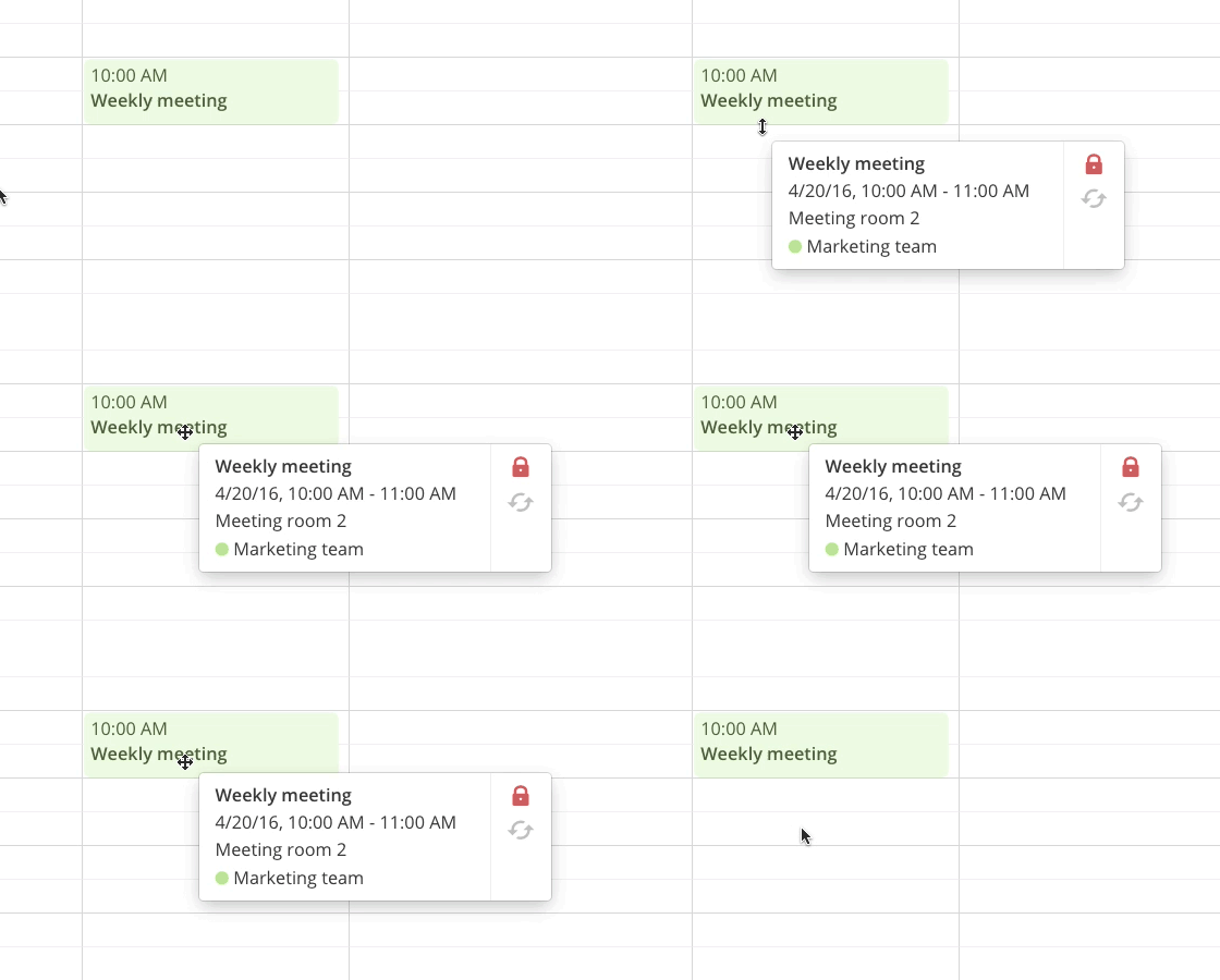
Well, good news! The event preview is back, and it's better and quicker than before! Just hover any event in your calendar to instantly see a preview of its information, as shown below:

Event preview demo

This effectively makes the calendar interaction faster and more useful. More improvements to interaction speed are on the way: you will soon be able to view the full event and edit it in a fraction of the time it gets just to view it.

Better organization of the contact screen

Staying on top of things is a common need in today's world, and even more when you happen to deal with many contacts. And when you are not the only person who updates those records, even more so!

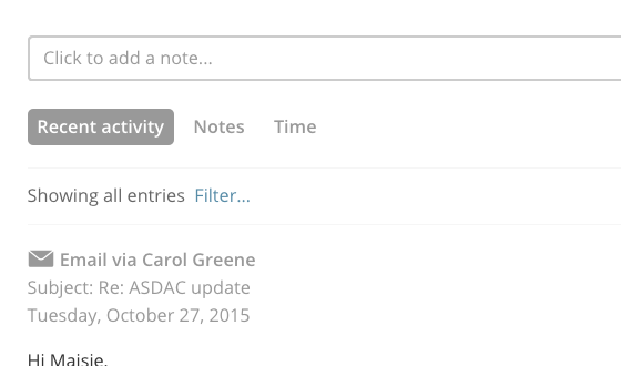
Starting today, there's a new Recent Activity tab in the contact detail screen, which helps you track the latest changes happened to a specific record.

Contact screen tabs

The Notes tab has been modified so that now notes are listed by the date specified on the note itself and not by the date the note was entered in Apollo. In this way you'll get a better sense on how interaction with the contact really unfolded over time!

Thanks for reading, see you next week!


Changes

  • Meetings in calendar are now signaled with an icon of group of people instead of a single person.

Enhancements

  • Better alignment of tab labels in contact, case and deal detail pages.
  • Added a confirm message when deleting calendars or calendar categories.

Bug fixes

  • The reload buttons in My tasks, Tasks across your projects and Tasks across your contacts were always resetting all filters set in those pages.
  • The loading message in some popup windows were forcing the scrollbar in those windows to appear.

Time saving shortcuts to set due dates

Monday April 11, 2016

Welcome back to our weekly update. This time we talk about due dates and the broken way we collect feedback from users!

Quickly set the due date for a task

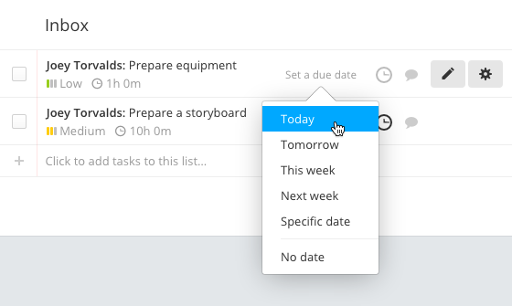
A recurring question to our support Team is about a way to set a task's due date without opening the task form. While this one-click operation has been available for a long time for tasks that already have a due date set – just click the task date and select a new one – those without one required you to click the Edit button, click the Due date box, set a date and then click Save.

Well, today there's a faster way, and it works almost exactly as if you were changing the due date: just hover on a task and click Set a due date, select the date, and you're done!

We manually keep track of user requests in a shared writeboard called “Users wish list”, where we also try to manually rank the most frequent ones. While taking care of Kevin V.'s feedback, we realized that the list of names under this enhancement was long enough that we'd better action on it. So thanks Kevin V. for being the straw that broke the camel's back :-)

Anyway, we feel that this manual method doesn't work very well, so we recently started a super secret project to fix it. More on this in the coming weeks!

Another way to create tasks with due dates

Because it's a semi-hidden feature, some of you may not know that there's another way to quickly create a new project task with a due date: write it in the task name itself!

Just open a project and click the textbox below any task list (where it says “Click to add tasks to this list”, duh!) then write your task followed by a date inside square brackets, like this:

Write newsletter for April 18 [04/15/2016]

You can also use a shorter date format like [04/15] or one of the text shorthands like [today], [tomorrow], [this week] or [next week]. Of course the date bit will be stripped out from the final task name.

That's it for this week, thanks for reading!


Enhancements

  • Better HTML tag filtering for contact/case/deal notes.
  • Better layout and sizing for the Filters popup in the contact/case/deal feeds.
  • Faster page loading for the project activity feed.
  • Task dates in "Tasks across all your projects" now show the pointer cursor instead of the arrow one.

Bug fixes

  • The remove buttons on contact tags are now aligned.
  • Tasklists created using multiple tasklist templates were not in the same order.
  • Overview: percent values for completed tasks and logged time variations had a little offset.
  • Overview: sometimes the "Show more" button didn't appear, even if there were more items to show.
  • Overview: time ranges for "this week" and "last week" in Team performance did not account for the user's culture and were always using Monday as the first day of the week.
  • Overview: totals for logged time in Team performance were not matching those in Time Reports (they were wrong in Team Performance, BTW).
  • Old calendar: the color picker wasn't visible when adding an event.
  • Milestone form: the "Email 48 hours before it's due" wasn't being hidden in some cases.
  • Mobile: file upload fields weren't file-uploading in some forms.