Building Apollo

Apollo behind the scenes: see what we are working on right now!

More little changes for your productivity

Thursday September 8, 2016

We're back with another Apollo update to fix those minor annoyances that bug you constantly without you even realizing. We've shown a few others in a previous post, so check that out too.

Without further ado, let's see what's changed.

Contact referrer autocompletion & backlink

In earlier versions of Apollo you could write down the referrer for a contact, but it was just a name, and was no real connection to another contact card. Now you can reference an existing contact as the referrer; just start typing the contact name in the Referred by field and select it from the dropdown.
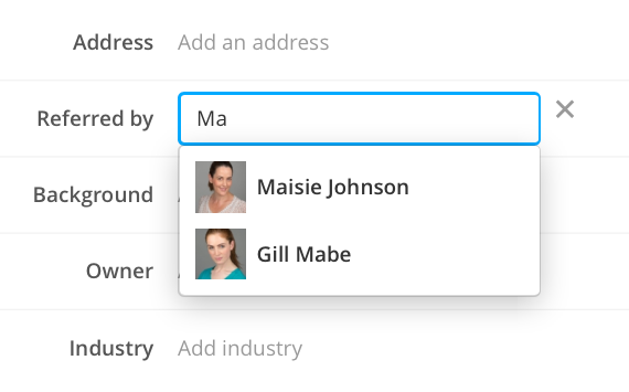
Searching a contact referer

Oh, and the referrer name is now rendered as a link in the contact page, so you can easily open it to see its data, too.

Thanks to Kersten A. R., this will be useful to everybody.

View the total duration of selected time entries

How many times, when managing the Time entries in a project, you found yourself calculating the subtotal for the selected time entries? Well, you can stop doing that, because Apollo does it for you. Just select a bunch of time entries and look for the total in the page header, near the number of selected time entries. Wonderful what these computers can do!
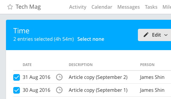
Time sub-total in page header

This is useful to check the value before issuing an invoice, or just see the total of the latest time entries – and it's available on every screen for managing Time.

Thanks Daniel I. for sending this in!

See the total number of projects in the workspace

This might be useful just to workspace owners, but still useful nonetheless. When looking at your plan information inside Settings, you can now see the number of total active projects near your join date.
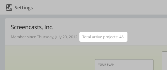
Project count in Your plan

Thanks Joanna K. for the request.

That's all Folks!

As some of you may have noticed, some of these have been available for a couple weeks or more; we just forgot to mention them. They all sparked from feedback sent by our users, so please keep going, your feedback will also benefit everybody else using the app!

Thanks for reading!


Enhancements

  • Added filtering by user in My Tasks, Tasks across your projects and Tasks across your contacts.
  • Other settings: removed the Tasks visibility section, since you can now set advanced custom filters in any other task listing screen.

Bug fixes

  • Task list form: task list template selection wasn't working.
  • For some workspaces, adding a task on a contact was failing.
  • Settings > Preferences: choosing to assign new tasks to "Me" didn't work; tasks were always unassigned.
  • Project calendar: the Events filter was broken.
  • Contact/case/deal detail screen: sometimes the time bulk actions buttons were not being shown.
Draw circles in annotations & skim PDF files

Monday August 29, 2016

The image proofing feature in Apollo has got more love from our developers. Specifically, there's a new ellipse tool and multipage PDF support. Let's see them in detail…

Ellipse tool

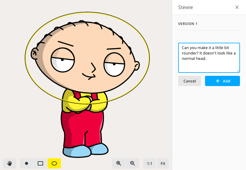
A few weeks ago we introduced a new tool for drawing rectangle shapes in annotations, in addition to Point drawings. Today, the Ellipse tool joins the family, so you can draw circle shapes to highlight image portions.

Ellipse tool example usage with an unusually quiet Stewie

As you can clearly see in the screenshot above, the tool has its uses!

Multipage PDF support

Just a few days after adding PDF file support and announcing that multipage support was coming soon, guess what? Multipage PDF support is here! You can now review multipage files like documents or graphic files with multiple artboards. This effectively makes the image proofing tool a document proofing tool.

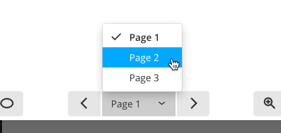
Multipage controls

Just upload a PDF file containing multiple pages, and skim them by clicking the page controls on the canvas toolbar. And yes, this also works on all those PDF files you already uploaded in your projects!

That's all for today, thanks for reading and see you soon!


Enhancements

  • Placeholders when there is not item to display are now vector, so they're sharp at every display resolution.
  • Tasks inside projects can now be filtered by responsible.

Bug fixes

  • Sometimes, once detached, the timers panel was not responding to the Timers button on the sidebar.
  • When editing a task, the "Notify me on completion" checkbox was not reflecting the real status of the setting of that task.
  • Project list: the Category selection box wasn't working in some cases.

PDF support and easier panning in image proofing

Thursday August 18, 2016

After receiving the ability to add squares and rectangles a few weeks ago, the image proofing feature continues its steady progress towards becoming a complete tool for sharing annotations with clients and team mates. Let's see what's new!

Full-canvas panning

Up until today, you could only pan the image canvas by dragging the image itself; this caused a bit of discomfort when using wide or tall images, or just zooming out more than necessary. It was also breaking the common conception of image viewers/editors, where you can drag the entire canvas to pan around.

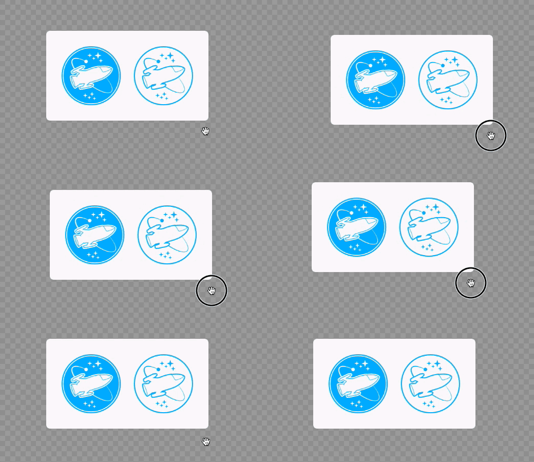
Today, Apollo works in the same way: just drag anywhere in the canvas to pan your image.

Dragging the canvas

This is a win for usability, and makes working with images a lot easier!

Support for PDF files

Apollo has a longstanding support for PDF files, but until today you couldn't annotate them. Some users worked around the problem by converting the PDF to an image format and uploading that one instead, but this wasn't an ideal workflow, since you ended up dealing with multiple files, and couldn't keep track of file versions easily.

To ease your work, we're very happy to announce that the image proofing feature now supports the PDF format. And before you ask, multipage PDF support is coming soon!

We're done! We hope we've made your work better today.

Thanks for reading!


Enhancements

  • Choosing to shift milestones while avoiding week-ends now takes user culture into account.
  • Task dates in tasklist templates can now be set to avoid week-ends.
  • Event detail tooltip: added hint to inform users when they're not allowed to edit that event.

Bug fixes

  • Calendar: Sometimes, moving the mouse pointer on any event would close any other open dropdown.
  • In some cases, deleting a calendar event wasn't working.
  • Project activity: the milestone creation date and responsible name weren't showing up.

Appearance customization extends to all users

Monday August 8, 2016

It's August, and it's hot outside, at least here in Italy. Luckily for us, technology advanced so much that we now have these amazing things called air conditioners, so that some of use can keep working on Apollo and bring you new features while the rest of the team is on the beach!

A few weeks ago, the new sidebar made its way into Apollo, and introduced the ability to set a background image. Suddenly, owners could customize their workspace even more than they thought.

The sidebar background, though – just like your phone's wallpaper – is very subjective stuff; inevitably, users started asking to select a different background than the one set in their workspace, even if they were not the owner of that workspace.

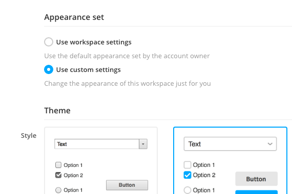
So today you can do just that: click the Gear button in the bottom section of the sidebar, select Settings, then click Custom appearance and set your personal appearance options for the workspace. That includes the application style and theme, and the sidebar background image.

Custom appearance options

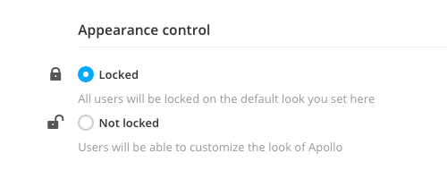
Workspace owners needn't worry, though. We're aware that some companies want a strict control of their branding, so we also provide a lock switch that prevents users from changing their own appearance settings for the workspace. To enable the lock, just open the Appearance page in Settings, scroll down to Appearance control, then click Locked.

Appearance control lock

That is all for today's update, we're looking forward to the next one.

Thanks for reading!


Enhancements

  • Comment indicators are now using new vector icons,
  • Mobile app: added ability to load the full desktop application, for browsers that don't have the "request desktop site" functionality built-in. Thanks to Lisa R.

Bug fixes

  • Upload file dialog window: the file list wasn't always in sync with the files that were going to be uploaded.
  • Tasks in the recurring tasks dropdown included the currently active task
  • Tasks in the recurring tasks dropdown and in My completed tasks were being rendered twice.
  • Sometimes, loading My completed tasks would fail.

Little changes for your productivity

Wednesday July 27, 2016

Today's update is all about the little things. You know, those little ones that fix some annoyances and help everybody to be more productive. All of them sparked from feedback sent by our users, so please keep going; as you will see in a second, your feedback benefits everybody!

Disable event dragging

In a busy calendar, the accidental drag that moves an event around (thus changing its date) is always behind the corner. To avoid that, you can now disable event dragging altogether.

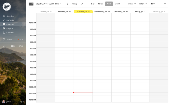
Just click the Gear button (top right of the calendar screen) and choose Block event dragging. That will block any event dragging action, but you will still be able to modify an event's date by opening the Edit event form.

Thanks to Camilla W. (among others) for the hint!

Close tabs by middle-clicking them

Middle-what? Long-time computer users know this little trick: to close a tab in your browser (e.g. Chrome), you can move your mouse pointer over its small Close button and click it. Or, just move it on the tab itself and click the middle mouse button – that is, the scroll wheel.

Starting today, the same works in Apollo tabs. To close them, click the close button or just middle-click them. Have a look at how easy is to close multiple tabs:

Closing tabs by middle-clicking

Neat! Thanks for the tip, Collin K.!

Invoice time entries in a contact, case or deal

Those who extensively use the time tracking abilities in Apollo know that you can issue invoices from inside the app, thanks to third party integration with FreshBooks and Harvest. Just click the Invoice button from inside a project or from the Projects' or Contacts' dashboard.

Specific contacts, cases and deals were left out, though. No more! Now you can open one of them, click the Time tab, select a few (or all) time entries and click the Invoice button to create an invoice. It's very useful to select the time entries related to a specific item in the CRM world of Apollo, and makes those screen on par with all other time-related ones!

Many thanks to Keryn M. for the tip!

We're done for today. There's a list of changes below, if you mind having a look.

Thanks for reading!


Enhancements

  • Project tasks page: added hint when trying to click the Completed tasks checkbox in the Filters dropdown.
  • Bigger textboxes in dialog boxes for modifying calendar names and categories. Bigger is better!
  • Faster task loading in My Tasks. Faster is also better!

Bug fixes

  • The "time logged" indicator on Tasks wasn't indicating that there was time logged.
  • Tasks across your contacts: links to the task detail page were not working.
  • Tasks across your projects: generated CSV files were not complying with the filters set.
  • Project activity: the name of the user who was given access to wasn't showing up. But it worked, we swear.
  • Sometimes saving a company contact with an owner set wouldn't work.
  • Overview: in some cases, clicking "Show more" in the contact feed wouldn't work or would show items in a random order.
  • My Tasks: "Tasks assigned to me" was also including those assigned to nobody.
  • Add task dialog box: sometimes, the Responsible field included multiple copies of the same user same user.
  • Changing task responsible from a project task lists' bulk actions wouldn't work.

Draggable timer panel

Monday July 18, 2016

Do you like the new Apollo sidebar? We hope so! We launched it two weeks ago, featuring a cleaner look, background image support, high resolution display support, and a renovated Timers button with at-a-glance status of the currently running timer.

We received a lot of feedback since then, and we discovered that our users have developed their own way to use Apollo.

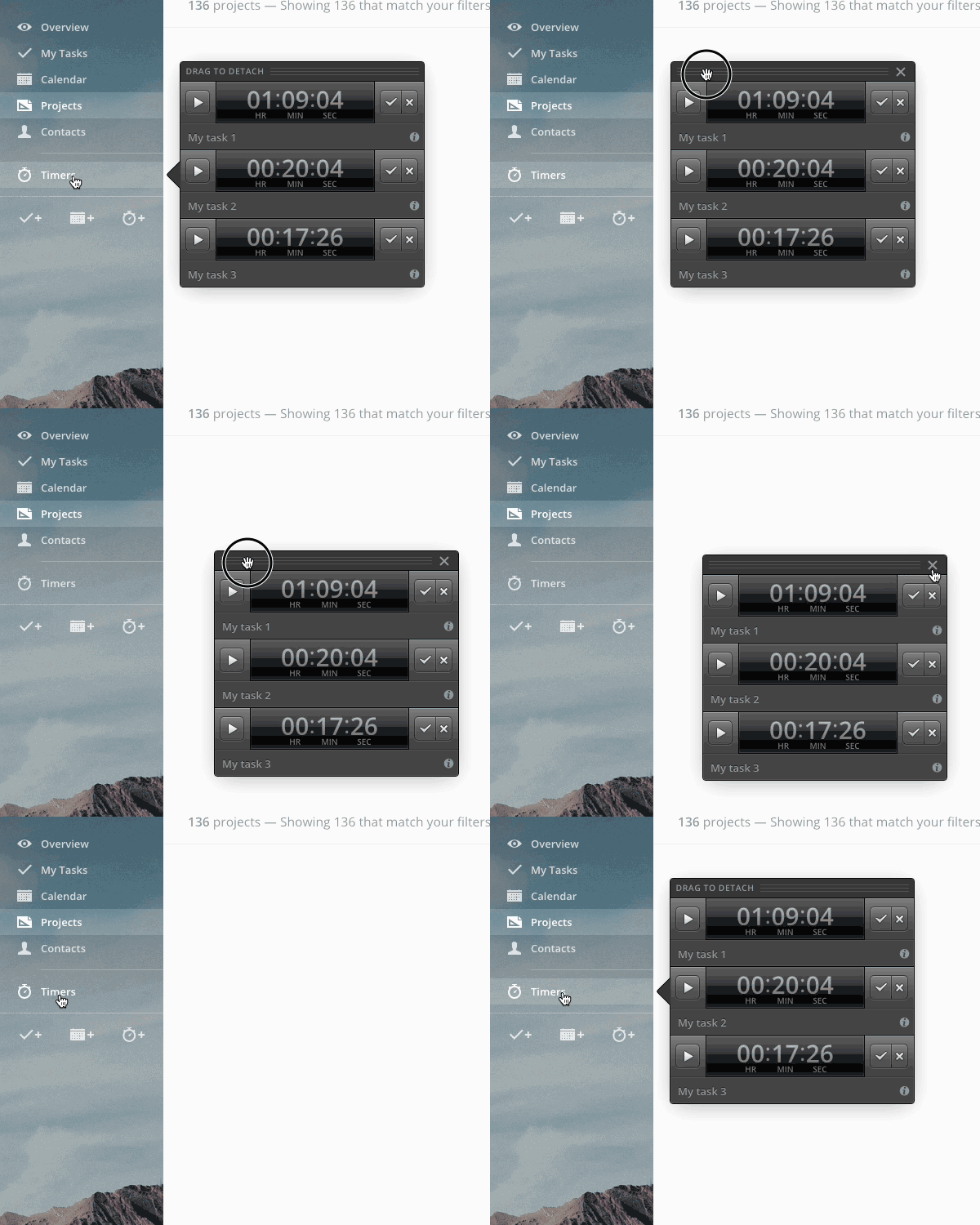
One specific user, Emily C., showed us her team's way of working, which involves keeping the timer panel always open: they use it as a place to keep all tasks that they are juggling during the day as a way to avoid forgetting about some of them. The new sidebar, which now displays the panel middle left (as opposed to the old one, which displayed it bottom left), makes it hard for them to keep the panel open at all times, because most of the time it covers the main content of the screen. The old way was more suitable to them because it didn't get in the way.

So we went back to the drawing board and made the timer panel detachable from the sidebar. We realize nobody has the power of making everyone happy, but we like to try hard anyway!

Detaching and re-attach the timer panel

How does it work?

That's very straightforward: with the timer panel open, look for the panel handle that says “Drag to detach” and… drag it away from the sidebar to place the panel wherever you want.

When detached, the panel will include a Close button: click it and the panel will disappear. Click the Timers button on the sidebar and the panel will be shown again, attached to the sidebar.

That's it for today! Have a look at the list of changes below, if you're interested.

See you next week!


Enhancements

  • Uniform look for Time reports in Projects and Contacts.
  • Rich text editor: swapped indent/outdent position to be consistent with arrow directions.
  • Task: new icons for comments.

Bug fixes

  • The avatar in Settings > Account couldn't be removed.
  • New sidebar: in some cases, the Timer panel would close leaving the Timers button active
  • Timer values weren't visible on Microsoft Edge
  • Old interface style: the timer panel background had been erroneously set to white.
  • Edit contact: the Category field wasn't showing the category color.
  • When saving a timer value, the "attached to" field wasn't showing the containing elements' icons (project, contact, etc.)
  • In some cases, enabling a user to let them access a project wouldn't show the checkbox for secondary permissions.
  • There was an invisible error when hovering the image proofing dialog's close button.

Pick specific people for file approval

Monday July 11, 2016

A couple months ago Apollo received a very useful addition: The file approval workflow. Since then, usage of files has skyrocketed so much that it, among others, pushed the need for a completely redesigned file list in projects.

In some use cases though, leaving the file open to anyone's approval is not ideal. Sometimes only specific people in a project must have the right to approve a file, be it the customer or anyone else, depending on the case.

So today we're adding the ability to choose who can approve a specific file.

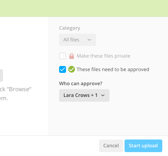
To do that, check the file approval checkbox when uploading a new file or editing an existing one, then select the people who can approve it from the dropdown.

Approval options in the file upload form

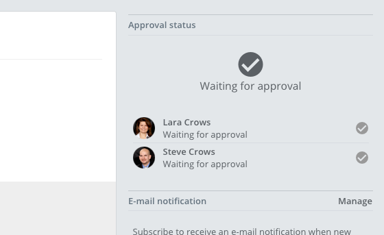
Once you select one or more users and save, the ability to approve that file will be restricted just to them – they'll get an email notification asking them to give their approval. All other users will only be able to see the approval status, either in the file list or in the file detail page, which now shows more data, such as who needs to approve, who gave their approval and when.

File approval status

We hope this will help your team workflow. See you next week for another update!

As always, you can find a list of minor changes below.

Thanks for reading!


Enhancements

  • Added ability to upload password protected PDF files.
  • Image proofing: added behavior to prevent drawing a point on top of another.
  • Time reports: wider date textboxes in the new flat style.
  • New layout for the time entries' bulk actions dropdown.
  • New layout for Settings > Integration.
  • Calendar: shorter day labels in month view, to avoid text wrapping on smaller screens.

Bug fixes

  • Trying to print the calendar would result in a blank page.
  • The contact list wasn't loading when using both a field filter and sorting by last name.
  • Opening the original file in a new tab from the file's detail page would also bring the user to the Overview.
  • In some cases, migrating to the new calendar wouldn't work.
  • Error in the Image proofing dialog box would prevent it from from reopening it after closing it.
  • Some buttons were a bit taller than others (just 1 pixel, but enough to notice).
  • Google Drive integration would stop working if Apollo was asked to re-authenticate from Google servers.
  • Tasklist checkboxes in the project's Tasks section were visible when switching to another section.
  • Project files: deleting a file with at least a comment to an annotation wasn't working.

The new sidebar

Monday July 4, 2016

The new sidebar in Apollo

This week we'd like to show you a brand new version of an element that has served us well for the past few years without breaking a sweat, but that unfortunately is showing the signs of its digital age: the Apollo Sidebar.

This new version has been available for testing to The Brave Collective (the group of Apollo users who get to try new features before everybody else) since last week.

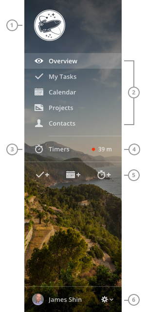
We built the new sidebar from scratch, and here's how it looks in all its glory:

Sidebar overview

It's sharper and more modern, and it's ready for high resolution displays, so users of retina or 4k displays will notice the change.

The logo (1) is now left aligned, so it doesn't look out of place when using small images. It can also be bigger (160x160px, up from 140x140px).

The section switcher (2) is basically unchanged, except for new icons and the removal of the Settings menu item (more on that in a moment).

The Timers button (3) has been moved up, and now shows the status of the current timer (4) at a glance.

Action buttons (5) have also been moved to the top part of the sidebar, and they behave exactly as their previous counterparts. From here, you can add a task, add an event, or start a new timer.

Finally, the User info (6) have been moved to the bottom part, and now it also acts as a button to access the Settings and the Send feedback and Logout items.

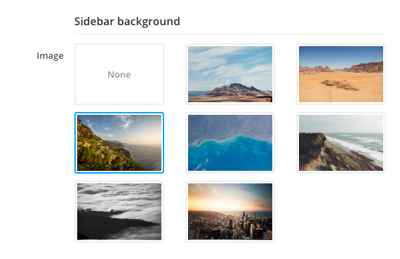
Customizable background image

As you can see, the sidebar uses a background image, which you can change or disable. To select another image, click the Gear dropdown, then Settings, then click the Appearance submenu and scroll down to Sidebar background

The available backgrounds

Tied to the new flat look

Keep in mind that the new sidebar is only available when using the new flat look. If you're still using the previous style, please drop us a message and tell us why you don't like the new one; remember that the old one will be removed once we feel that the new one is mature enough.

That's all for this week, but there's the usual list of changes below, for those interested.

Thanks for reading!


Enhancements

  • Tasks: new layout for the Log time dropdown.
  • Note form: better field alignment.
  • Proofing dialog: added very basic scrolling to the first element in the canvas when selecting an annotation thread.
  • Contact list: better layout for bulk actions dropdowns.
  • Settings: changing theme style and reloading the app now goes back to the same Settings page instead of the default page.

Bug fixes

  • The new Files section in Projects was being cut off in Internet Explorer 10/11.
  • Images in our ImageWell component were overflowing on Internet Explorer 10/11.
  • Some pages, especially those in tabs, were showing a double scrollbar with invisible content.
  • The Merge project button wasn't showing up for silent projects.
  • Add time dialog box: the case and deal lists were always empty.
  • The Log time dropdown in the contact, case and deal detail views were always showing no time logged.
  • Tasks added via email were showing garbled text when using special characters with non-UTF-8 encoding.
  • API: Loading projects for external users was including archived projects (that external users shouldn't have access to).
  • Assigning a task using the "@" shortcut wasn't working when usernames contained specific special characters.

Square your annotations

Monday June 27, 2016

The image proofing feature announced a few months ago has really taken momentum; our users find it insanely useful to communicate with coworkers and clients – and vice-versa! Think about it: you can let your client add their annotations to guide you, or just add yours to show them a specific bit of an image.

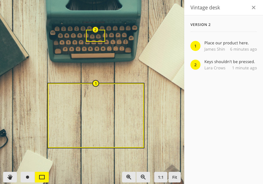
Given the popularity of the feature, user requests are very common. So we now have a few things on the way, but today we'd like to introduce the ability to draw rectangles to highlight a specific portion of an image.

Annotation example with rectangles

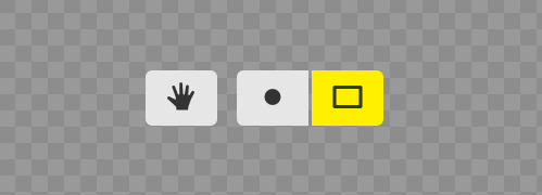
The most visible change in the interface is the toolbar. The previous one had two buttons, Pan and Annotate, respectively for looking around your image and for adding points on it. Today, the Annotate button becomes two separate buttons: one for adding points and one for adding rectangles. Also gone are the text labels; you'll find only icons from now on: the hand (pan) and the point and rectangle (the annotation type).

The new toolbar

As you might imagine, using it is dead simple: just click the Rectangle button and drag on the image to draw – guess what? – a rectangle, write your comment in the right side of the dialog box, then press the Add button and you're done!

Remember, you can also add multiple rectangles for each annotation, or mix them with points – just switch tool before hitting the Add button.

That's it for today. As always, there's a list of additional changes below.

See you next week!


Enhancements
  • User sessions are now kept active for longer, because typing username and password is boring.
  • API: added support for cross domain requests (CORS compliant).
  • Timers are now wider. Too much pasta.
  • Saving a tasklist is now faster. Because optimizations.
Bug fixes
  • Loaders inside tasklist headers were awfully static (i.e.: not spinning).
  • Billing: in some cases payment could not be made from the Account page in Billing settings.
  • Underlying fixes on the handling of recent projects and contacts.
  • The event detail popup sometimes were being cut vertically on small screens.
  • Mobile: logging time on a project task would link it to the project itself, not to the task.
  • Files attached to task comments could stay visible when changing a tasklist privacy setting or when moving the task in or out of a private tasklist.

Task filter presets everywhere

Monday June 20, 2016

A few weeks ago, we introduced the ability to save filter presets in My Tasks. It allowed you to save custom sets of filters and recall them with a couple clicks.

Just a few minutes after making it available to everybody, advanced users started praising the new feature and asked to have it on all task listing pages.

With today's update, you can do just that: save filter presets in every screen where you can filter tasks. That includes the Project's Tasks page, the Tasks across all your projects page and the CRM Tasks page.

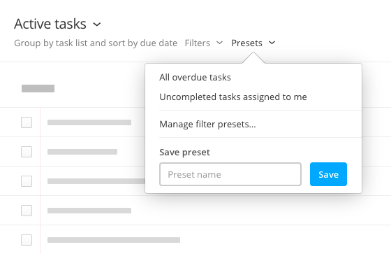
Task filter presets in the Project Tasks page

That's all for today!

Too little, you say? This is the 32th update in 32 weeks straight, give us a break!
To satisfy your appetite for new things, though, there's an additional list of changes below.

Thanks for reading!


Enhancements

  • Overview: better alignment for the icons in the recent element list.

Bug fixes

  • Overview: The number of milestones due today inside the Milestones dropdown wasn't showing correctly.
  • Task filter presets weren't correctly setting up grouping and sorting.
  • Task status filters (Started, Not started) were gone missing in My Tasks.
  • Task pages: the number of tasks wasn't always correct.