Do you like the new Apollo sidebar? We hope so! We launched it two weeks ago, featuring a cleaner look, background image support, high resolution display support, and a renovated Timers button with at-a-glance status of the currently running timer.
We received a lot of feedback since then, and we discovered that our users have developed their own way to use Apollo.
One specific user, Emily C., showed us her team's way of working, which involves keeping the timer panel always open: they use it as a place to keep all tasks that they are juggling during the day as a way to avoid forgetting about some of them. The new sidebar, which now displays the panel middle left (as opposed to the old one, which displayed it bottom left), makes it hard for them to keep the panel open at all times, because most of the time it covers the main content of the screen. The old way was more suitable to them because it didn't get in the way.
So we went back to the drawing board and made the timer panel detachable from the sidebar. We realize nobody has the power of making everyone happy, but we like to try hard anyway!

How does it work?
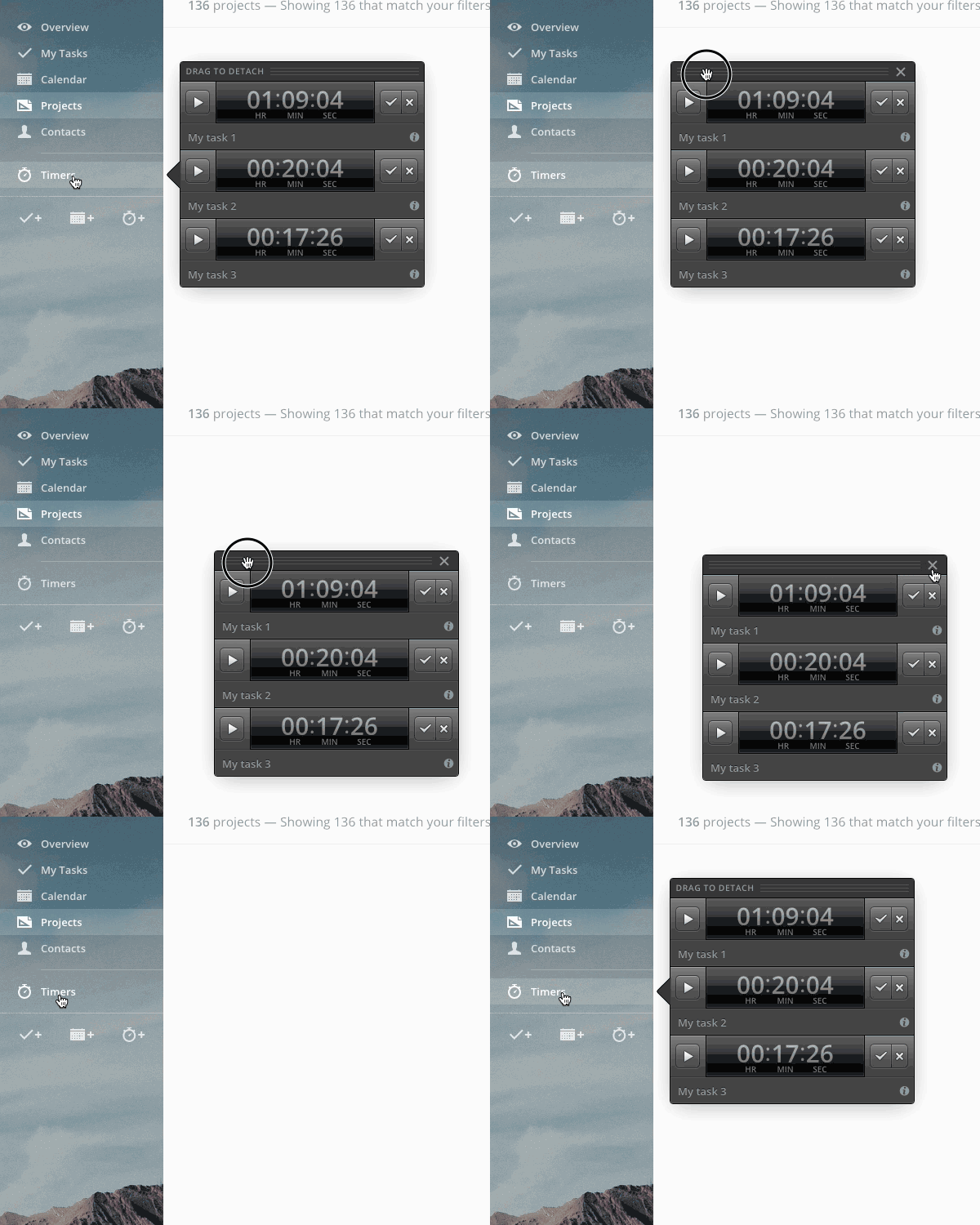
That's very straightforward: with the timer panel open, look for the panel handle that says “Drag to detach” and… drag it away from the sidebar to place the panel wherever you want.
When detached, the panel will include a Close button: click it and the panel will disappear. Click the Timers button on the sidebar and the panel will be shown again, attached to the sidebar.
That's it for today! Have a look at the list of changes below, if you're interested.
See you next week!
Enhancements
- Uniform look for Time reports in Projects and Contacts.
- Rich text editor: swapped indent/outdent position to be consistent with arrow directions.
- Task: new icons for comments.
Bug fixes
- The avatar in Settings > Account couldn't be removed.
- New sidebar: in some cases, the Timer panel would close leaving the Timers button active
- Timer values weren't visible on Microsoft Edge
- Old interface style: the timer panel background had been erroneously set to white.
- Edit contact: the Category field wasn't showing the category color.
- When saving a timer value, the "attached to" field wasn't showing the containing elements' icons (project, contact, etc.)
- In some cases, enabling a user to let them access a project wouldn't show the checkbox for secondary permissions.
- There was an invisible error when hovering the image proofing dialog's close button.