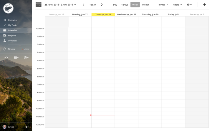
This week we'd like to show you a brand new version of an element that has served us well for the past few years without breaking a sweat, but that unfortunately is showing the signs of its digital age: the Apollo Sidebar.
This new version has been available for testing to The Brave Collective (the group of Apollo users who get to try new features before everybody else) since last week.
We built the new sidebar from scratch, and here's how it looks in all its glory:

It's sharper and more modern, and it's ready for high resolution displays, so users of retina or 4k displays will notice the change.
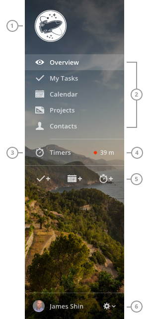
The logo (1) is now left aligned, so it doesn't look out of place when using small images. It can also be bigger (160x160px, up from 140x140px).
The section switcher (2) is basically unchanged, except for new icons and the removal of the Settings menu item (more on that in a moment).
The Timers button (3) has been moved up, and now shows the status of the current timer (4) at a glance.
Action buttons (5) have also been moved to the top part of the sidebar, and they behave exactly as their previous counterparts. From here, you can add a task, add an event, or start a new timer.
Finally, the User info (6) have been moved to the bottom part, and now it also acts as a button to access the Settings and the Send feedback and Logout items.
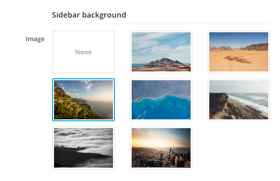
Customizable background image
As you can see, the sidebar uses a background image, which you can change or disable. To select another image, click the Gear dropdown, then Settings, then click the Appearance submenu and scroll down to Sidebar background

Tied to the new flat look
Keep in mind that the new sidebar is only available when using the new flat look. If you're still using the previous style, please drop us a message and tell us why you don't like the new one; remember that the old one will be removed once we feel that the new one is mature enough.
That's all for this week, but there's the usual list of changes below, for those interested.
Thanks for reading!
Enhancements
- Tasks: new layout for the Log time dropdown.
- Note form: better field alignment.
- Proofing dialog: added very basic scrolling to the first element in the canvas when selecting an annotation thread.
- Contact list: better layout for bulk actions dropdowns.
- Settings: changing theme style and reloading the app now goes back to the same Settings page instead of the default page.
Bug fixes
- The new Files section in Projects was being cut off in Internet Explorer 10/11.
- Images in our ImageWell component were overflowing on Internet Explorer 10/11.
- Some pages, especially those in tabs, were showing a double scrollbar with invisible content.
- The Merge project button wasn't showing up for silent projects.
- Add time dialog box: the case and deal lists were always empty.
- The Log time dropdown in the contact, case and deal detail views were always showing no time logged.
- Tasks added via email were showing garbled text when using special characters with non-UTF-8 encoding.
- API: Loading projects for external users was including archived projects (that external users shouldn't have access to).
- Assigning a task using the "@" shortcut wasn't working when usernames contained specific special characters.