This week's Apollo update brings good news to a group of users who were fairly vocal and consistent with their wish.
It all started 6 months ago with a request from Micha M., which was quickly followed by similar ones from other users. Once we realized it wasn't an isolated request, we were more than happy to follow through. So, from today you can…
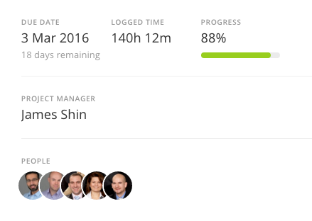
Set a project manager and see all its projects
You have now the ability to select a specific person in a project to become the project manager. All you have to do is open a project, go to Project settings and select the corresponding user in the Project manager field. The project manager will be shown on the project summary in the activity screen.

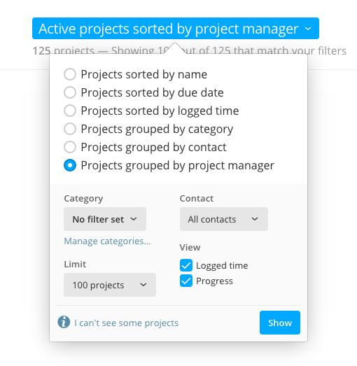
But there's more: you can now group projects by project manager in the project list, for easy tracking.

Flat style to become the default one
After unveiling a new look for the Apollo user interface last week to The Brave Collective users, we didn't expect to receive so many comments and praises about it. We even received a feedback asking to fix the feedback window itself!
In fact, we have received so much feedback that, even if it's still a bit rough, we're going to set the new look as the default one for new workspaces, and giving everybody the ability to switch back and forth between the old and the new one. Remember though: we'll move away from the old look once we're confident enough that the flat one is ready, so we can focus on a single look and new features.
To switch to the new look, go to Settings, then Company identity, scroll down and click the box with the new style (the one on the right), then confirm your choice to reload Apollo.
That's it for this week, but we also have a fairly large list of changes below.
Thanks for reading!
Changes
- The new overview do not show disabled users anymore (thanks Janine W.!)
- Flat style: to save space, buttons in the rich text editor are now smaller.
Enhancements
- Project list: the dropdown menu items for the “Project options” buttons have now a different order and are easier to follow.
- Project list: added a “Manage categories” link inside the view options dropdown.
- Project list: due project dates are now shown in red.
- Better alignment and spacing for the writeboard and contact forms.
Bug fixes
- The first date textbox in the Project's Time reports page was missing the left border.
- My Tasks was not showing any task when grouping by Task type.
- Projects with no due date were being shown in the project list as having a due date set at 01/01/5000. No doubt, even a deadline so remote would have been missed.
- The invite form in the People and permissions screen was being cut off in some cases.
- Main overview: the “Show more” button was missing some white space below it.
- Flat style: some arrow buttons weren't correctly filling their container.
- Flat style: feedback type selection buttons in the feedback window weren't showing correctly.
- Flat style: a project's main menu items weren't collapsing inside the dropdown menu when there was little space to show them.
- Mobile: changing the status of a task wasn't updating all views showing that task.
- Project list: the dropdown menu items for the “Project options” buttons have now a different order and are easier to follow.
- Project list: added a “Manage categories” link inside the view options dropdown.
- Project list: due project dates are now shown in red.
- Better alignment and spacing for the writeboard and contact forms.